Try this setup#
Open in the editor Home page → Split banner
Use two image-and-text panels for complementary collections or product benefits.
- Open Split banner and select the first Banner block. Choose its Image, Heading, Text and Button link.
- Configure the second block with a different but related message. Keep both button labels specific.
- Review image placement and the mobile order. Avoid putting essential information only inside the source images.
See the Split banner controls
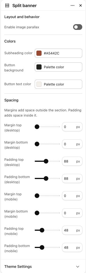
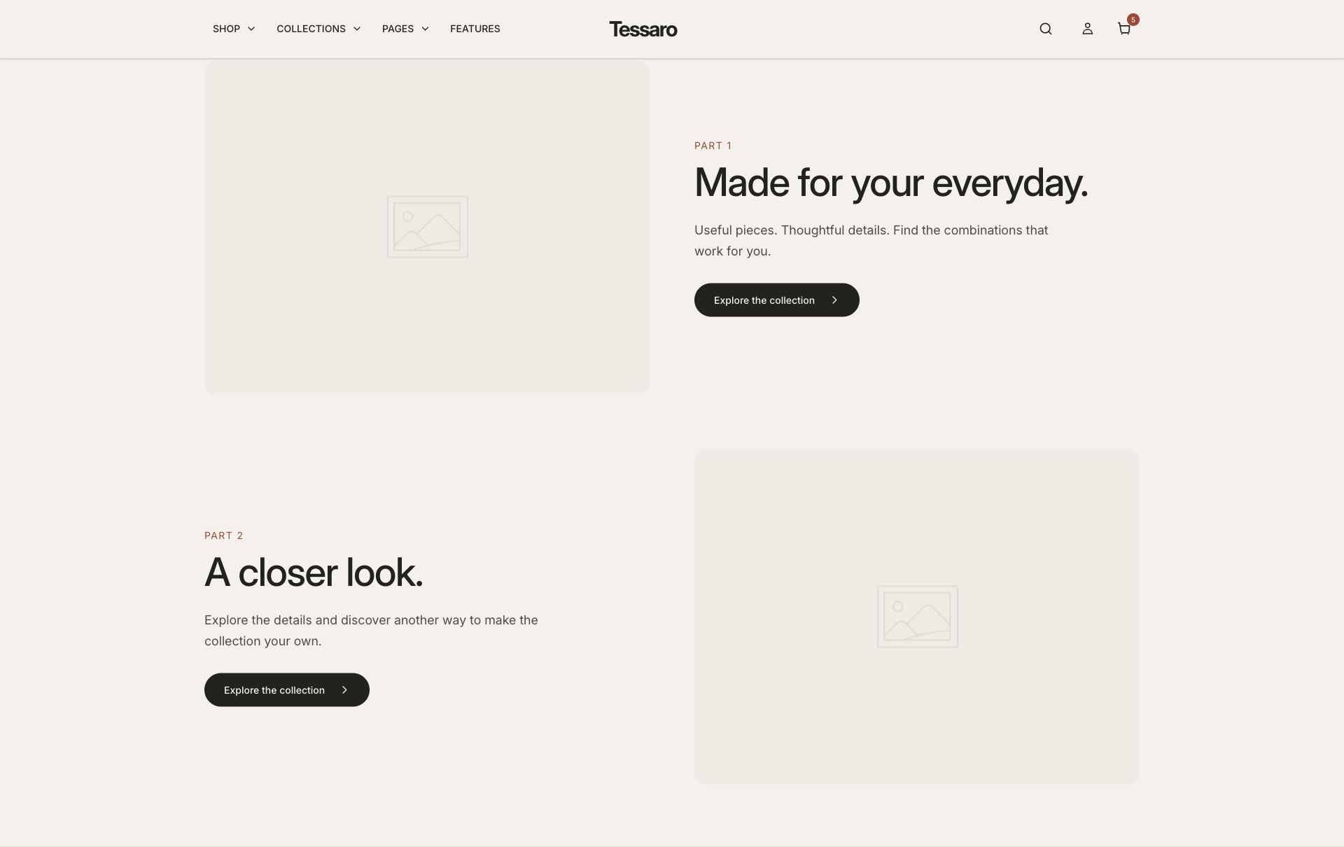
What to look for Each panel has a distinct purpose and leads somewhere useful; the stacked mobile order still makes sense.
When to use it#
Create paired campaign panels with independent media and links.
Set up#
Add the supported banner blocks and choose images/videos, text and destinations.
Available from Add section where supported by its template restrictions.
Section settings#
These are schema defaults. Your installed theme or selected preset can use different saved values.
Layout and behavior
Enable image parallax#
Adjust this control in the theme editor and preview the result in the relevant template.
- Control
- checkbox
- Default
- Off
Colors
Subheading color#
Adjust this control in the theme editor and preview the result in the relevant template.
- Control
- color
- Default
- #806042
Button background#
Adjust this control in the theme editor and preview the result in the relevant template.
- Control
- color
- Default
- #1F1B17
Button text color#
Adjust this control in the theme editor and preview the result in the relevant template.
- Control
- color
- Default
- #FFFFFF
Spacing
Margins add space outside the section. Padding adds space inside it.
Blocks#
Add, reorder and configure the supported blocks in the editor. Some block types have an individual limit.
Banner#
Image#
Adjust this control in the theme editor and preview the result in the relevant template.
- Control
- image picker
- Default
- Not set
Video (takes priority over image)#
Adjust this control in the theme editor and preview the result in the relevant template.
- Control
- video
- Default
- Not set
Subheading#
Adjust this control in the theme editor and preview the result in the relevant template.
- Control
- text
- Default
- Not set
Heading#
Adjust this control in the theme editor and preview the result in the relevant template.
- Control
- text
- Default
- Tell your story
Text#
Adjust this control in the theme editor and preview the result in the relevant template.
- Control
- richtext
- Default
- <p>Add a description of your brand, product line, or campaign. Showcase what makes your store special.</p>
Show button#
Adjust this control in the theme editor and preview the result in the relevant template.
- Control
- checkbox
- Default
- On
Button label#
Adjust this control in the theme editor and preview the result in the relevant template.
- Control
- text
- Default
- Learn more
Button link#
Adjust this control in the theme editor and preview the result in the relevant template.
- Control
- url
- Default
- Not set