Try this setup#
Open in the editor Home page → Category cards grid
Help people choose a category before they browse individual products.
- Open Category cards grid and select each Category block.
- Use Link to choose the intended collection or page. Set Image, Heading and Subheading for the card.
- Keep the most useful categories first. Remove extra blocks rather than leaving unrelated examples visible.
See the Category cards grid controls
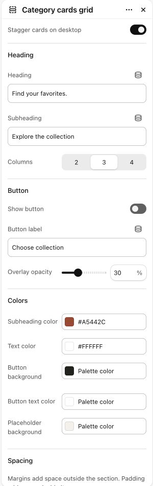
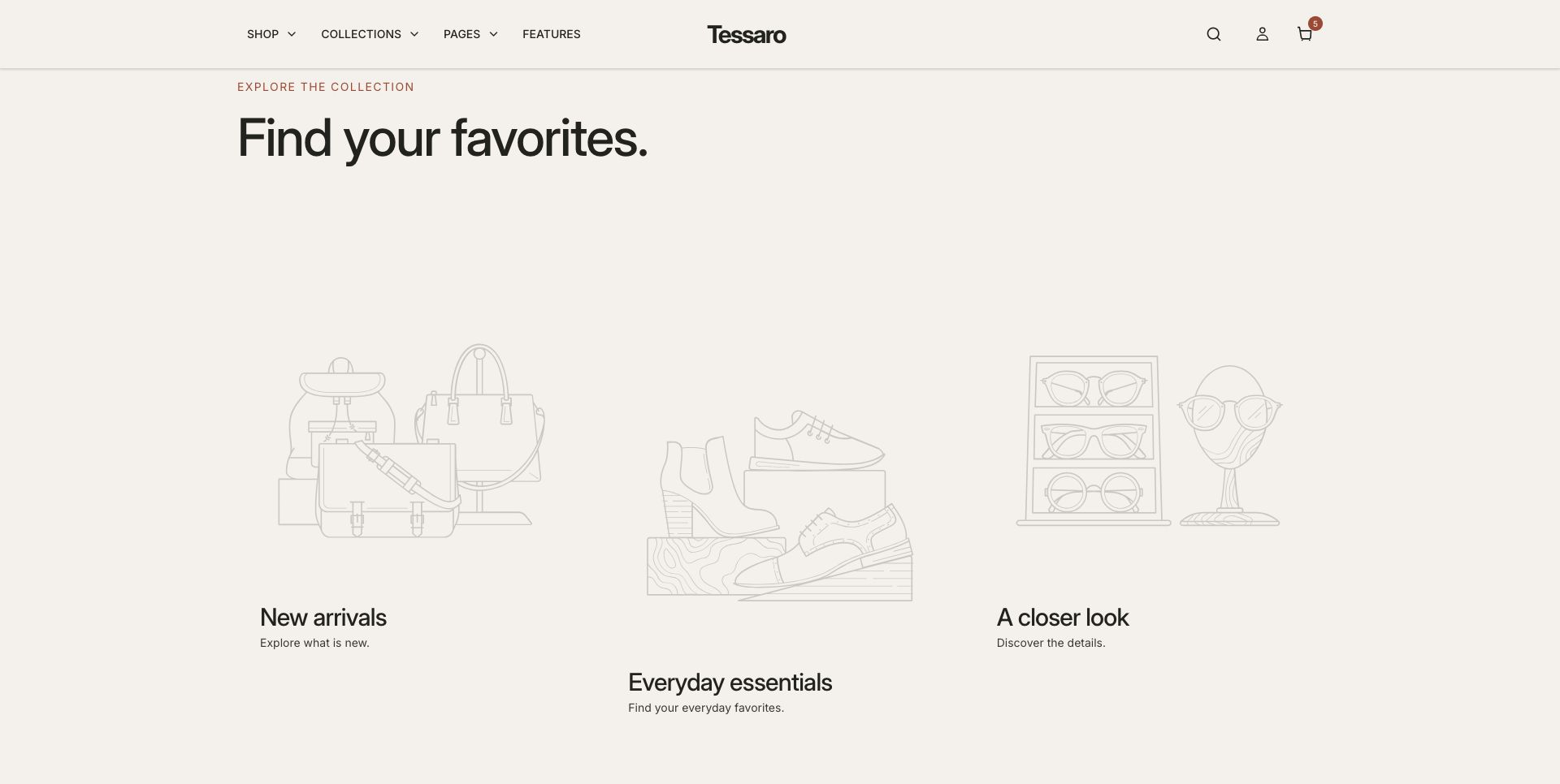
What to look for Every card has a meaningful image, a clear label and a working destination.
When to use it#
Link visual cards to collections, categories or campaigns.
Set up#
Add a Category block per card, choose its image, title, subtitle and actual destination.
Available from Add section where supported by its template restrictions.
Section settings#
These are schema defaults. Your installed theme or selected preset can use different saved values.
Stagger cards on desktop#
Adjust this control in the theme editor and preview the result in the relevant template.
- Control
- checkbox
- Default
- Off
Heading
Heading#
Adjust this control in the theme editor and preview the result in the relevant template.
- Control
- text
- Default
- Shop by category
Subheading#
Adjust this control in the theme editor and preview the result in the relevant template.
- Control
- text
- Default
- Not set
Button
Show button#
Adjust this control in the theme editor and preview the result in the relevant template.
- Control
- checkbox
- Default
- On
Button label#
Adjust this control in the theme editor and preview the result in the relevant template.
- Control
- text
- Default
- Shop collection
Colors
Subheading color#
Adjust this control in the theme editor and preview the result in the relevant template.
- Control
- color
- Default
- #806042
Text color#
Adjust this control in the theme editor and preview the result in the relevant template.
- Control
- color
- Default
- #F5F5F5
Button background#
Adjust this control in the theme editor and preview the result in the relevant template.
- Control
- color
- Default
- #1F1B17
Button text color#
Adjust this control in the theme editor and preview the result in the relevant template.
- Control
- color
- Default
- #FFFFFF
Placeholder background#
Adjust this control in the theme editor and preview the result in the relevant template.
- Control
- color
- Default
- #F0EAE1
Spacing
Margins add space outside the section. Padding adds space inside it.
Blocks#
Add, reorder and configure the supported blocks in the editor. Some block types have an individual limit.
Category#
Image#
Adjust this control in the theme editor and preview the result in the relevant template.
- Control
- image picker
- Default
- Not set
Heading#
Adjust this control in the theme editor and preview the result in the relevant template.
- Control
- text
- Default
- Category name
Subheading#
Adjust this control in the theme editor and preview the result in the relevant template.
- Control
- text
- Default
- Not set
Link#
Adjust this control in the theme editor and preview the result in the relevant template.
- Control
- url
- Default
- Not set