Try this setup#
Open in the editor Home page → Newsletter
Explain what subscribers will receive before asking for their email address.
- Open Newsletter and write a specific heading and description.
- Set up consent and email marketing in Shopify or your email provider. If you promise an incentive, configure its actual delivery workflow.
- Preview the form and confirm the signup result through your approved store testing process.
See the Newsletter controls
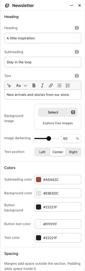

What to look for The form explains the benefit honestly. A section heading alone does not send a welcome email or create a discount.
When to use it#
Place an inline Shopify newsletter signup form in a page.
Set up#
Set the signup heading/text and optional background image, then style the form.
Available from Add section where supported by its template restrictions.
Section settings#
These are schema defaults. Your installed theme or selected preset can use different saved values.
Heading
Heading#
Adjust this control in the theme editor and preview the result in the relevant template.
- Control
- text
- Default
- Join our newsletter
Subheading#
Adjust this control in the theme editor and preview the result in the relevant template.
- Control
- text
- Default
- Not set
Text#
Adjust this control in the theme editor and preview the result in the relevant template.
- Control
- richtext
- Default
- <p>Get exclusive offers and new product updates straight to your inbox.</p>
Background image#
Adjust this control in the theme editor and preview the result in the relevant template.
- Control
- image picker
- Default
- Not set
Colors
Subheading color#
Adjust this control in the theme editor and preview the result in the relevant template.
- Control
- color
- Default
- #806042
Background color#
Adjust this control in the theme editor and preview the result in the relevant template.
- Control
- color
- Default
- #F0EAE1
Button background#
Adjust this control in the theme editor and preview the result in the relevant template.
- Control
- color
- Default
- #1F1B17
Button text color#
Adjust this control in the theme editor and preview the result in the relevant template.
- Control
- color
- Default
- #FFFFFF
Text color#
Adjust this control in the theme editor and preview the result in the relevant template.
- Control
- color
- Default
- #2C2825
Spacing
Margins add space outside the section. Padding adds space inside it.