Choose desktop and mobile media#
Choose media for its job#
| Location | Recommendation |
|---|---|
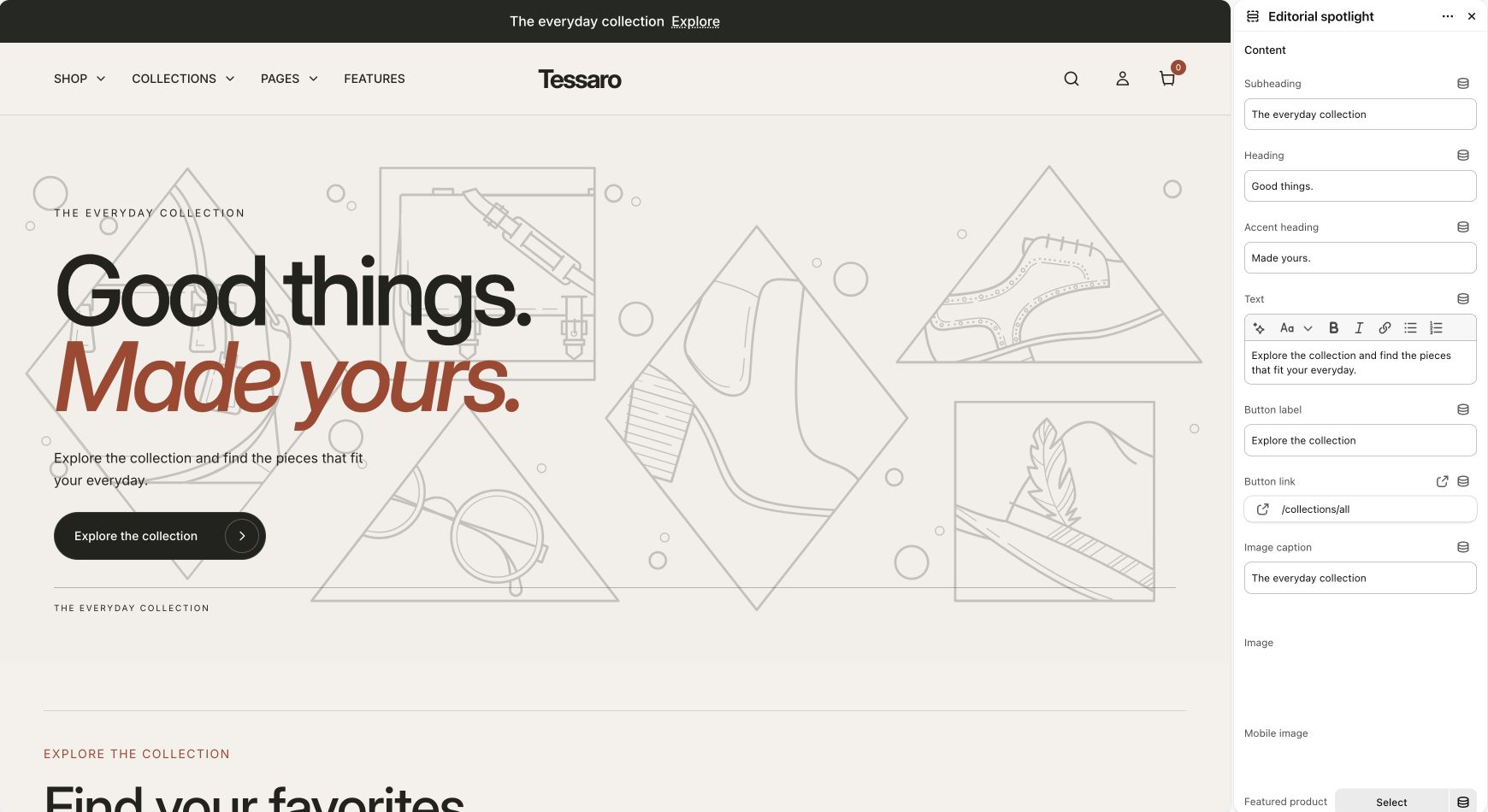
| Hero or editorial banner | Use a source image with room for the intended text position. Use a dedicated mobile image when available. |
| Product gallery | Upload media to the product in Shopify and order it deliberately. Connect variant images when colors differ. |
| Before/after | Use images of the same subject with matching dimensions and camera framing. |
| Cards and grids | Keep the subject visible at the chosen crop and consistent across a row. |
| Video | Use the supported video picker/source in the section. Provide useful accompanying text instead of relying on sound alone. |
Product gallery and zoom#
The Product page section controls image zoom and gallery width. Its Gallery images setting can show all images or use the configured variant-related behavior. A variant’s featured image comes from product data; select images on the corresponding variants in Shopify.
Accessibility and performance#
- Write meaningful alt text for informative images in Shopify. Decorative imagery can have empty alt text.
- Check text on the lightest and darkest parts of a banner; adjust overlay and colors.
- Use original high-quality images; the theme requests responsive sizes where implemented.
- Reduce unnecessary autoplay video and third-party scripts before removing useful content.
- A theme setting cannot repair a source image with unreadable text embedded in it.